There are many different camera movements that can be used when filming. Some of these can include:
Panning.
This is when a camera is moved from side to side. The lens of the camera scans the scene to provide the viewer with elements of a scene that cannot be included in a wide-angle shot. A pan can also reveal information that is needed. It can follow a moving object or person/group of people. Generally when using panning in a shot, it is smooth but when adjusting the tension and drag on your tripod this will be used in a way to change the smoothness of the pan and tilt.
Tilt.
This is when the camera head is moved up or down. By tilting the camera head up, you can show height in a shot and by tilting it down you can show a lot of depth. It can also show relationships, for example, the tilt of the camera from a man standing on a rocky ledge with a coiled rope on his shoulder to a man standing alone at the base of the cliff presesnts the situation.
Tracking Shot.
A shot in which the camera is pushed horizontally along the ground on a dolly.
Dolly.
This refers to a type of shot achieved when a camera is mounted on a cart pushed along a track.
Crane.
A shot in which the camera rises above the ground on a mobile support.
Steadicam.
This is a mechanism used for steadying a hand-held camera which consists of a shock-absorbing arm to which the camera is attached and a harness is worn by the camera operator.
Hand-held.
This is when a person holds the camera in hand whilst shooting.
Zoom.
This is a single shot which moves towards a particular subject.
Reverse zoom.
This is a single shot which moves away from a particular subject.
Friday, 30 September 2011
Shot Angles
There are many different types of shot angles that could be used in filming to create a certain effect on the audience. Examples of these could be:

Low Angle.
This is an angle that is taken from a low position in which is looking up to an object or person. For example, when filming a character from a low angle, shooting the camera from just below their chin would be a low angle.
 Eye-level Angle.
This is an angle that is taken straight on to a person or object. For example, when focusing on a certain character, the camera will be shot straight on so that the camera will be looking directly into their eye line.

High Angle.
This is an angle that is taken from above a person or an object. For example, when focusing on a certain character, the camera will be shot from just above the top of their head.

Canted Angle.This is a shot that is taken at a slanted angle of a person or an object. For example, if a character is lying down, the camera would be shot at them from a slightly slanted angle.
Bird's eye Angle.
This is an angle which is taken from a high point and looks down onto a person or an object. For example, if a person was standing directly upwards and the camera was being shot from directly above them, this would be a type of birds eye angle.

Further Camera Shots
We then moved on to learning about different types of camera shots.
Match on action.
This is also known as cutting action and is an editing technique for continuity editing in which one shot cuts to another shot in which portrays the action of the subject in the first shot.
This particular shot creates the impression of continuity and the action that is carried through creates a 'visual bridge' in which draws the viewer's attention away from slight problems in the continuity cutting.
Match on action is not a graphic match or match cut, it portrays a continuous sese of the same action rather than matching two seperate things together.
Shot reverse shot.
This is a continuity editing technique that is used in conversations or just simply characters looking at one another or objects.
A shot showing what the character is supposedly looking at (could be either a point of view or over the shoulder shot) is then followed by a reverse angle shot of the character themselves looking at it, or for example, of the other character looking back at them.
Shot reverse shot can often tie in with the 180 degree rule to retain continuity by not distorting the audience's sense of location of where the characters are in the shots.
180 Degree Rule.
The 180 degree rule is a filming guideline that shows in a scene the same left-right relationship between characters. The filming can only take place within the 180 degree rule angle in which is maintained in a conversation for example.
For example, when you see soliders walking from left to right to the front lines, and right to left when they return home, creating a continuous sense of direction.
This will then allow the audience ro have a greater sense of location in the scene in terms of what may be off-screen in some shots, for example in shot reverse shots.
Thursday, 15 September 2011
Different camera shots used in 'Pretty Woman'
I decided to pick out a few camera angles from the film 'Pretty Woman' staring Julia Roberts. I chose this film because it is one of my favourites and I think that some of the camera angles used are very interesting.

I think that this particular shot shows a Two Shot, and I chose it because when I first looked at it, I felt as if i could feel the emotion in the moment between the two characters. They both look to be almost sly and guilty about something, but also they both have small half smiles on their faces which to me shows inner happiness in the moment between them both.

The next shot that I chose I felt could both be an over the shoulder shot and a point of view shot. The reasons why I thought it fitted into both types of angles was because, when you first look at the scene, the angle is directly over the main characters shoulder, yet her face can be seen in the mirror in front just as it would be in a normal over the shoulder shot. But also, the reason why I felt it could also be a point of view shot was because although the shot is reflected in the mirror, we, as the audience are still seeing what the main character is seeing within the shot, which is her reflection in the mirror. In this particular scene I feel that both characters are feeling a sense of lust for one another due to the way that they seem to be delicately talking to one another, and also as the male in the shot is romantically placing the necklace around his neck with a beaming smile on his face.

This particular shot that I chose, I felt was a long shot, as you can see the main characters physique from head to toe, minus the bottom half being covered by the dress. The reason why I chose this shot because I feel that it was a significant part of the film, where the feelings between the two characters arise onto the surface. And I feel that this is shown very well within the way that the camera has been angled because as shes walking in, they are both looking directly into one anothers eyes, and despite everything around them, they are focusing on eachother as if nothing else is there.

The final shot that I chose was a close up shot of the main female character. The reason why I chose this shot was because it shows a vulnerable side to a usual strong minded character within the film, but here she looks slightly vulnerable. But also I noticed an intense glare in her eyes towards the person that she is looking at, it looks as if she is hooked on them and will not let them out of her site.
I really enjoyed studying different camera angles from films because I felt myself watching films in a much more observant way than I ever had done before. I paid attention to all lighting used, backgrounds and the types of shot in which the characters in the film were being portrayed, and I found it really intriguing when thinking about how that particular shot had been created, why it had been used, and what mood it created within a particular scene.

I think that this particular shot shows a Two Shot, and I chose it because when I first looked at it, I felt as if i could feel the emotion in the moment between the two characters. They both look to be almost sly and guilty about something, but also they both have small half smiles on their faces which to me shows inner happiness in the moment between them both.

The next shot that I chose I felt could both be an over the shoulder shot and a point of view shot. The reasons why I thought it fitted into both types of angles was because, when you first look at the scene, the angle is directly over the main characters shoulder, yet her face can be seen in the mirror in front just as it would be in a normal over the shoulder shot. But also, the reason why I felt it could also be a point of view shot was because although the shot is reflected in the mirror, we, as the audience are still seeing what the main character is seeing within the shot, which is her reflection in the mirror. In this particular scene I feel that both characters are feeling a sense of lust for one another due to the way that they seem to be delicately talking to one another, and also as the male in the shot is romantically placing the necklace around his neck with a beaming smile on his face.
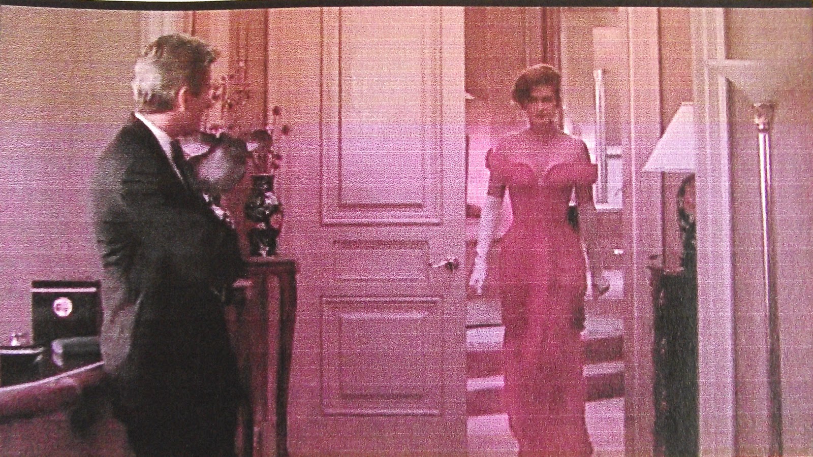
This particular shot that I chose, I felt was a long shot, as you can see the main characters physique from head to toe, minus the bottom half being covered by the dress. The reason why I chose this shot because I feel that it was a significant part of the film, where the feelings between the two characters arise onto the surface. And I feel that this is shown very well within the way that the camera has been angled because as shes walking in, they are both looking directly into one anothers eyes, and despite everything around them, they are focusing on eachother as if nothing else is there.

The final shot that I chose was a close up shot of the main female character. The reason why I chose this shot was because it shows a vulnerable side to a usual strong minded character within the film, but here she looks slightly vulnerable. But also I noticed an intense glare in her eyes towards the person that she is looking at, it looks as if she is hooked on them and will not let them out of her site.
I really enjoyed studying different camera angles from films because I felt myself watching films in a much more observant way than I ever had done before. I paid attention to all lighting used, backgrounds and the types of shot in which the characters in the film were being portrayed, and I found it really intriguing when thinking about how that particular shot had been created, why it had been used, and what mood it created within a particular scene.
Sunday, 11 September 2011
Connotations And Denotations of a TV Advert
To make sure that we understood how to use connotations and denotation properly, we got set a piece of homework in which we had to choose an advert that we had seen on the TV and then study it and comment on both connotations and denotations to do with the topics; Location/Setting, Costumes/Make-up, Props and Lighting/Colour.
I chose to study the advert for Ninento 3DS's 'Nintendogs and Cats' game that includes the girlband 'The Saturdays'. The reason why I chose to study this particular advert was because I thought it had a lot of potential connotations and denotations that could be studied in all of the given areas.
http://www.youtube.com/watch?v=nm4E4vMCJJw
This is the link to the advert that I chose to study. I noticed many connotations and denotations about it when watching it in detail a few times.
I firstly noticed that the setting for the advert was in a dressing room/lounge area, so it could be in an apartment, which to me, as the main girl in the advert is placed on the sofa relaxing, is showing that the game is coming across as a relaxing game as the majority of people who play a games console play it whilst lounging around in their homes.
The outfits in which the two main girls as wearing stood out to me, as one of the girls is wearing blue and the other pink, which I feel the advert is pointing out that the game can be played by both girls and boys and not just stereotyped to one gender because of the people in the advert. Also the colors in the advert are very neutral, the white walls in the background and the pale blues and greens that can also be spotted in the background could also link to the thought of the game being for both genders.
The props in the background of the advert are of books, plants, TV's; which all to me come across as homely yet fairly modern so it attracts to both teenagers as they want to be up to date and want everything modern and if the whole feel of the advert is modern, its going to attract to them even more. And the fact that the props are also homely attracts adults as it makes it seem like a family orientated game that everyone in the family could play either together or apart.
The sun and outside is the main source of lighting in the advert which could be promoting the fact that the game does not harm the environment. Also, in the first shot of the advert, i noticed that the lighting around the dressing table is shining down onto the product being sold, just as a spotlight does on the main star in a musical or theater play etc, so this makes the product immediately stand out as soon as the advert begins.
Overall, I really enjoyed evaluating a television advert because it allowed me to come up with my own original ideas about what each detail of the advert could mean and what it could stand for which i found interesting, as it allowed me to think more in depth about the details and what certain things could symbolize even if this didn't seem obvious on the surface of the advert the first time I saw it.
Semiotics
In today's lesson we learnt about semiotics, which on a representational level means the examining of a text. We learnt that when talking about semiotics, you have to focus on what the relationship between the elements of the text are, for example, the camera angle, font, colours, sound etc. And also how these factors could all be linked.
We then moved on to looking at four issues of the same magazine in which were released at the four seasons around the year; spring, summer, autumn and winter. We then had to match the seasons to a magazine issue and then explain why we thought the two went together.
For the first magazine, I came to the conclusion that it was for the winter issue as the colour scheme of the magazine was red and gold, which I always resemble with Christmas, and this being in winter, I decided that it was best fitted for this issue of the magazine.
For the second magazine, I came to the conclusion that it was for the summer issue as the colour scheme was very light and airy; using a baby blue as the background shade, and a sun kissed yellow as the font colour, immediatly made me think of summer. Also the fact that the image on the front was of a woman whom had very light makeup on and her hair loosely placed around her face, gave the impression of a natural summer look that could possibly be located of someone being on holiday on a relaxing beach.
For the third magazine, I came to the conclusion that it was for the autumn issue as the colour scheme used a deep shade of blue, and a light leafy colour of brown for the font colour which made me think of leaves falling from trees as they do in autumn, so to me this was fairly obvious to match autumn with this particular magazine issue.
Finally, for the fourth magazine, I came to the conclusion that it was for the spring issue of the magazine, as the colour scheme was very bold and bright. The colours used were a pale pink and white font. The pink stood out to me as being for the spring issue as it made me think of a warm springs night with a pale pink sky. The white font also helped me think of spring because, in spring, a lot of people begin to wear white, as a build up to the summer months ahead. And as the image on the cover was of a girl wearing a white dress, this linked to the type of clothing that I would wear in springtime so it made it easier for me to try and link which season the magazine issue went with.
In conclusion, my first taster of using semiotics to describe what I could see within an image using a mixture of colours, fonts, imagery etc went well, as I found it easier to point out factors that could help me understand an image, and made me think more in depth about what colours and fonts mean rather than just looking at them and not thinking anymore of it aside from the fact that it looks good.
Friday, 9 September 2011
Connotations and Denotations
Today we learnt about denotations and connotations and how to use them. We learnt that connotations show the idea or meaning suggested by/or associated with a word or thing whereas a denotation is more visual and therefore is an explicit or direct meaning rather than by a suggestion.
We then moved on to trying out using denotations and connotations on our own, when looking at a visual image for an advertisement for Calvin Kleins fragrance 'Eternity'. In the image for the perfume advert we saw a woman with her daughter on her shoulders surrounded by a countryside and sun beaming down on them from the top right corner. The image displayed text at the top that read 'Eternity' in block capital letters; this being the name of the perfume. Also the name of the brand 'Calvin Klein' in a smaller font size in the centre bottom of the image, with a reasonably sized smaller font underneath that read 'Perfume', both being in lower case letters.
Some of the denotations that we saw within the image were how all of the text was in grey and in different font sizes yet the same font type. The location for the advertisement image was set in the countryside with a harsh sunlight beaming down from the top of the image, which was mainly aimed from the top right hand side of the image.
Some of the connotations that we saw within the image were how the font was thin and let the actual photography dominate the shot rather than the text, perhaps showing that the image is the main way to convey the story behind the campaign and for people to be able to think about the product in a story manor rather than just text to tell the customers what the product is with no imagination.
The font is also fairly subtle and as it is in a light grey shade, meaning that the perfume is timeless and can be kept as part of heriatage within a family and can be passed down through generations as grey was the main source of colour of old photography therefore stating that although the perfume is modern, the scent is timeless, as is the relationship between the mother and daughter in the image, and in real life.
Overall, for a first lesson, i feel as though i learnt a lot about how to use both connotations and denotations properly and i will be using them as much as i can whenever analyising work from now on.
Subscribe to:
Posts (Atom)