
20th Century Fox
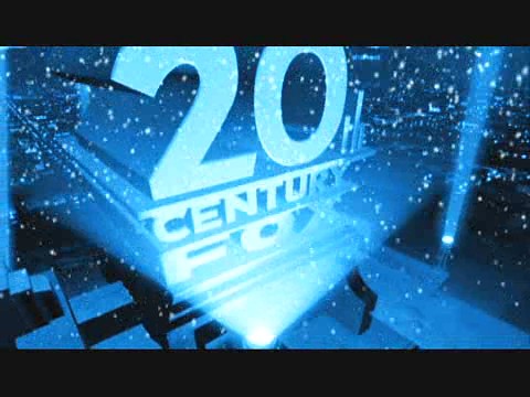
The logo for 20th Century Fox includes a dark sky in the background possibly reinstating the idea that the majority of audiences visit the cinema or watch films during the evening/night time.
The gold writing allows the company to not aim their audiences at one gender in particular as the gold/yellow colour could attract both mixed audiences. The font of the writing is also plain, simple and easy to read possibly so that not only it is the main focus of the logo but also to perhaps suggest that people with not so good vision will easily be able to read it and not feel discriminated with the use of fancy un-readable writing.
The building that the text is based on appears to be fairly exclusive, as there are spotlights surrounding it and focusing on the text that is in the middle. This possibly suggesting that by seeing a film that has been produced by this company, you will be given an experience like no other and each audience member is thought about within the film individually.
20th Century Fox has made me want our group company logo to be able to be varied and altered depending on the genre of film in which we create, as I feel that this would make it a much more interesting experience for the audience and would attract them to visit another film made by our company.
No comments:
Post a Comment